It’s subtle, but it’s there: Google tests design change for the Android YouTube app
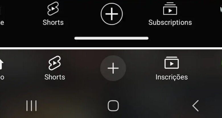
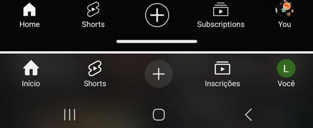
First, let’s discuss the changes being made to some of the icons. The “Home” icon, the first one on the bottom bar, is getting a small change with the roof on the house now slightly wider than the sides of the wall. The “Plus” button in the middle of the bottom bar will no longer feature a white circular design and the “Subscriptions” icon no longer gives the illusion of multiple YouTube video screens. That is accomplished by reducing the number of horizontal lines on top of the icon from two to one.
And the biggest change is the one that will be made to the bottom bar itself. Currently, the bar is translucent so if you’re using Light mode, it will be white and if you’re in Dark mode, it will be in black. With the change, the panel will be blurry with splotches of white interrupting the solid black. We can’t show you what this blurry design will look like in Light mode because it appears that very few Android users are involved in this test so far.
On top is the current YouTube bottom bar and on the bottom is the new bar being tested (note that this user kept the three-button navigation). | Image credit-9to5Google
Also noteworthy, the new design showed up on a phone that was using the old three-button navigation system which made the bar look much bigger compared to the gesture navigation version used to show the current state of the bottom bar. To reiterate, the blurred bottom bar appears to be the subject of a very limited test at the moment.
Some YouTube subscribers are also going to be guinea pigs for another test that will show recommendations for long-form videos in their YouTube Shorts feed. The goal is to give YouTube content providers another place where their work can be discovered.
Source link